A Truly Personal Experience

“The kitchen looks f****** epic and we both love it! Nathan’s vision has really come to life and the thought put into it really shines through. We are amazed by his work. Nathan’s attention to detail is impeccable and massively appreciated.
We can’t believe this kitchen is ours! We’re going to have a big party just to show it off. We can’t thank Nathan enough.”


BESPOKE MODERN MINIMAL KITCHEN & DINER WITH STRIKING STYLISED ELEMENTS
VICTORIAN VILLA | CLAPHAM, LONDON
A turnkey kitchen refurbishment project incorporating all aspects of project management and bespoke kitchen, furniture, interior and lighting design.
Initially, just the dining table, bench-seating and sideboard were designed and installed, and the client’s original vision for the table and benches initiated a clean, minimal, powder-coated steel design for the base and legs with solid sandblasted oak tops. This clean form transferred to the sideboard, and the bright block yellow was inspired by a new piece of art for the space, resulting in a cohesive dining area.
The clients’ requirement to change the rest of the space, an old and tired kitchen, met with a reticence to live with the upheaval, so the proposal had to be exciting. The sole design direction, to use rusted metal material, left a freedom and openness for creative interpretation. It was clear the client would respond positively to a striking design, nothing safe or familiar, as well as strong elements of colour echoing a home filled with vibrant art and interesting shapes.
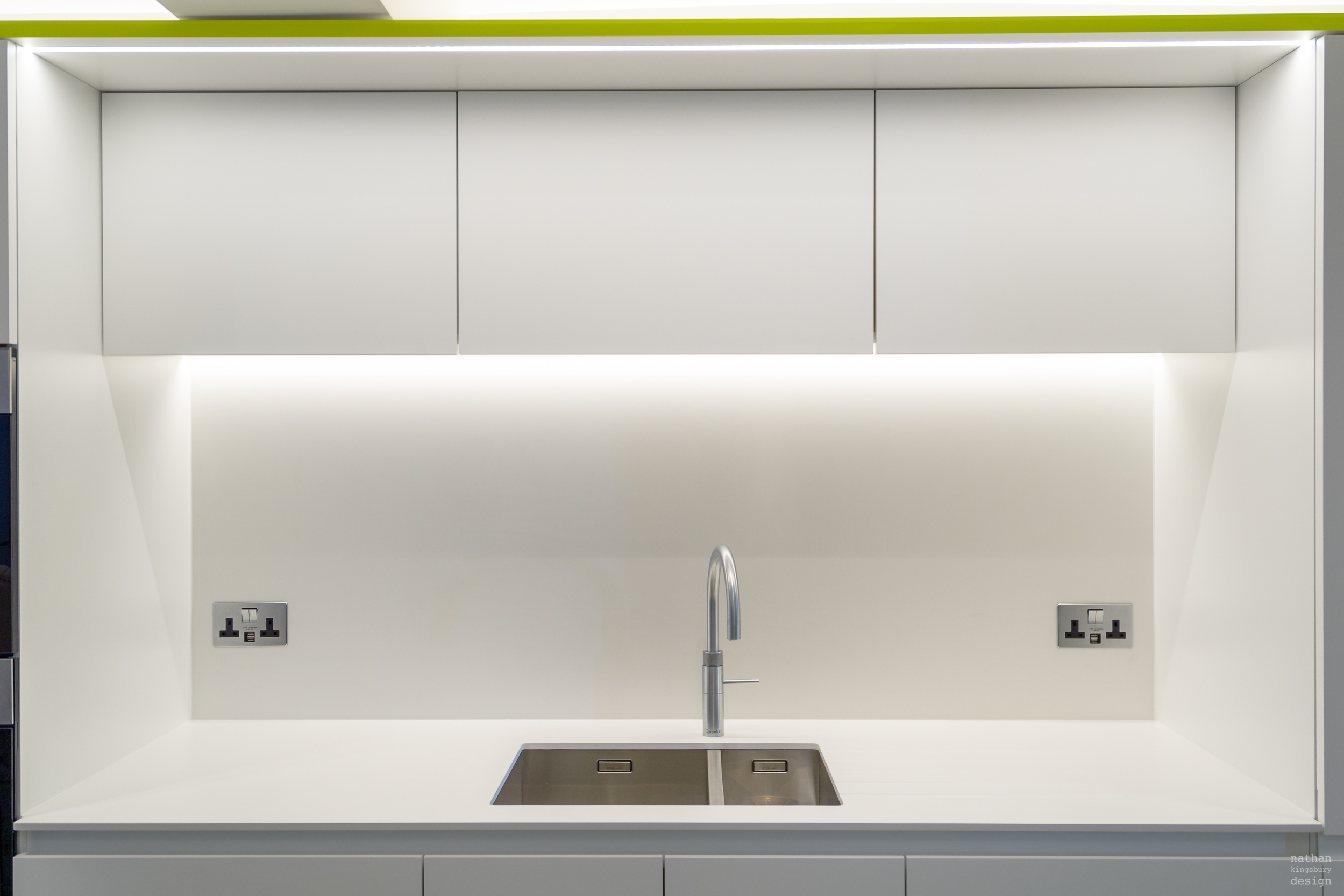
The kitchen design is unusual and distinctive. Its clean, minimal form is in total contrast with a defining strike-through of vivid colour and prominent stylised elements. Whilst the layout didn’t change completely, the design transformed the kitchen dramatically.
The wall cabinets have a very clear, minimal, white aesthetic, yet this white is soft. The walls, skirtings and floor tiles continue this theme, sitting in the background whilst the other design elements push forward. For continuity the tiles start at the front door and work their way through the entrance hall and into the kitchen
Taking it one step further, to accentuate this, the cabinets, worktop, splashback and walls are all matt white. By avoiding a stringent, reflective white, the matt surfaces draw light in. This provides the necessary contrast with the fluorescent frame and textured island. Drawing light into the space maximises the impact of each element. Pow! The frame is almost alive; it is singing at you. Sometimes you harmonise, but with this aspect of the design the contrast is the power and what the eye is drawn to.
The ceiling beam could have created a disjointed break in the line of the main cabinets by bisecting these, but the frame performs the additional role of eliminating this by unifying the cabinets. This is repeated on the opposite cabinets, creating a framework for both and emphasising the rectilinear design.
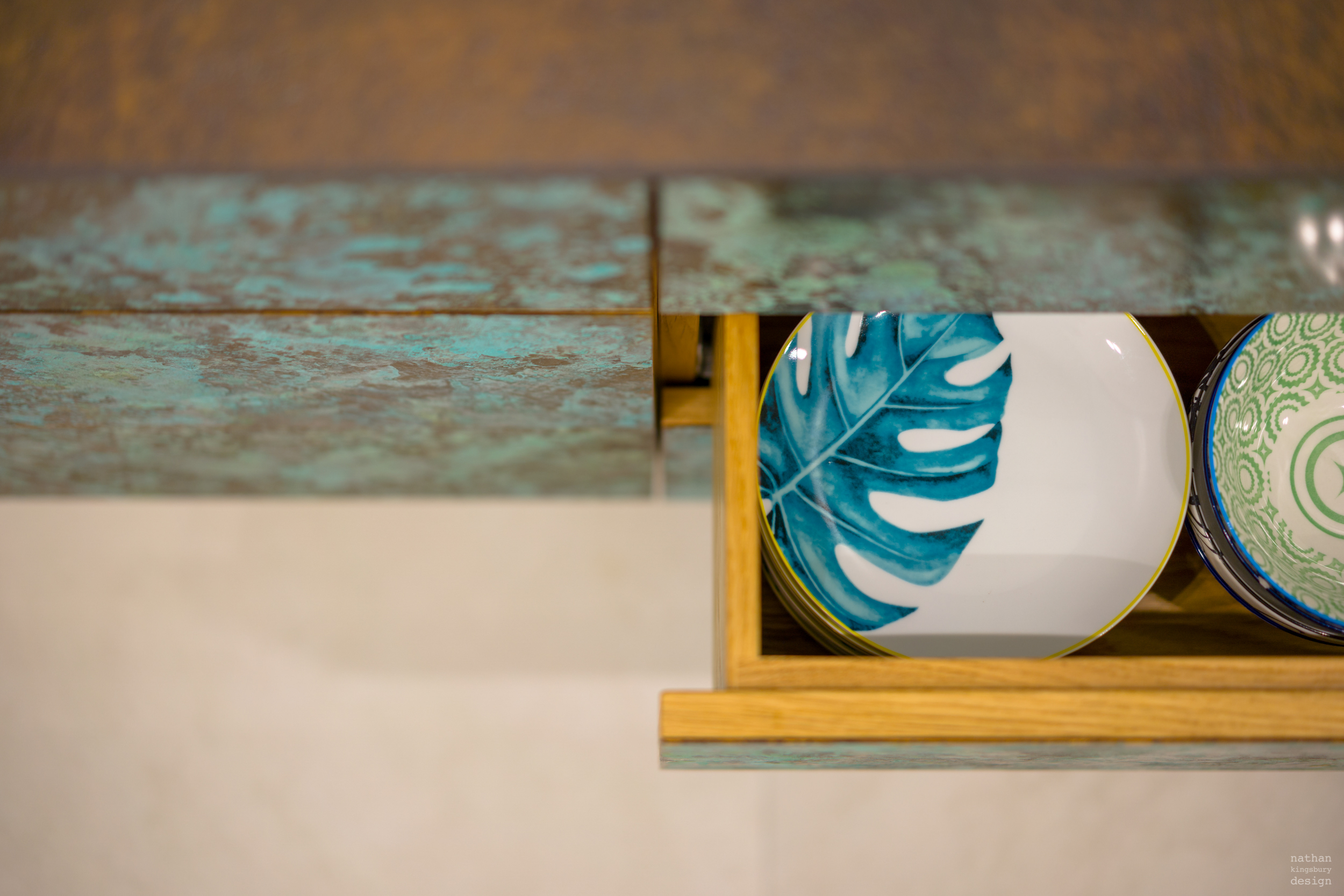
The island is a striking centrepiece; it is alive in a more natural way. Fulfilling the requirement for rusted metal, it needed a darker, textured tone and a strong definition to provide its own powerful voice.
The island worktop gives the illusion of raw oxidised metal, whereas the faces reveal the fascinating blue and orange tones of patinated brass. The ends of the island needed to be equally impressive to strike an impact from the living room arch, the garden and kitchen doors. With narrow dimensions, a mirrored base, geometric features and combining both surface materials at each end, the island appears lighter. Inspired by angular forms in a faceted piece of art in another part of the house, the combination of the distinct shapes and unyielding materials create a strong aesthetic. Its appearance is that of a sculpture, connoting the robot-esque legs of a manmade beast. It is a truly conversational piece.
The linear LED lighting strip above the sink cabinets strengthens the rectilinear form in the design. As an extension of this lighting strip, the conceptual lighting of the pendant above the island is a strong centrepiece in that it does not distract from the core minimal design due to its highly minimalist style. These streamlined tubes of light, an elementary form from an admired architect, are positioned at subtly different angles in a line along the island, reinforcing the uncomplicated appeal of the space.
Atmospheric lighting is visible behind the splashback, washing light down the surface and illuminating the area by differing degrees. Light above, and all the way along, the main cabinets accentuates the main frame of the kitchen.
To complement the design the clients took the recommendation for island seating; compact without arms, a white finish and curved back detail.
Walls & cabinets - Little Greene Loft White No. 222
Frame - Ral Fluorescent Yellow
Pendant - Alphabet of Light Linear by Bjarke Ingels Group
“We always felt involved in the process from the start. Nathan drafted drawings and checked in with us throughout the construction and finishing stages. His artistic eye enabled us to get a piece that fits to our style and we are always getting comments on the furniture. The quality is second to none and the value for money is exceptional.”